www.npr.org
By ALLISON AUBREY and CARMEL WROTH
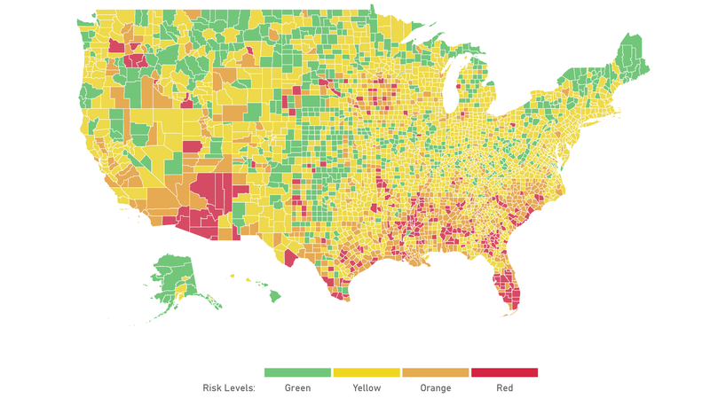
To find your county’s risk level, explore the county-level map here.
How severe is the spread of COVID-19 in your community? If you’re confused, you’re not alone. Though state and local dashboards provide lots of numbers, from case counts to deaths, it’s often unclear how to interpret them — and hard to compare them to other places.
“There hasn’t been a unified, national approach to communicating risk, says Danielle Allen, a professor and director of the Edmond J. Safra Center for Ethics at Harvard University. “That’s made it harder for people,” she says.
Allen, along with researchers at the Harvard Global Health Institute, is leading a collaboration of top scientists at institutions around the country who have joined forces to create a unified set of metrics for the coronavirus pandemic, including a shared definition of risk levels — and tools for communities to fight the virus.
The collaboration launched these tools Wednesday, including a new, online risk-assessment map that allows people to check the state or the county where they live and see a COVID-19 risk rating of green, yellow, orange or red. The risk levels are based upon the number of new daily cases per 100,000 people.
A community that has fewer than one daily new case per 100,000 is green. One to 9 is yellow; between 10 and 24 is orange; and 25 and above puts you in the red. “When you get into that orange and red zone it means, in all likelihood, you’re seeing a lot of velocity, a kind of fast upward trend,” Allen says.
As of Wednesday, over 200 U.S. counties were in the red zone, with populations totaling more than 36 million people.
This is by no means the only attempt to categorize risk levels across the United States. There are a number of frameworks out there using different measures. And that can lead to confusion, says Allen. “What we really need is a shared vocabulary and shared way of presenting data across jurisdictions,” she says. This effort represents the consensus of eight institutions and more than a dozen individual experts who have agreed on these metrics.
There are other important metrics when it comes to tracking the spread and severity of COVID-19. Local government leaders need to know how many people are dying and how many people are hospitalized. They need to know how many tests are coming back positive in an area. (The lower the positivity rate, the more likely a community is testing enough to accurately detect the spread of the virus.)
But the group settled on tying the alert level to numbers of new COVID-19 cases per 100,000, because that’s a good indicator to show the current picture of outbreaks and compare them in a consistent way. It’s a standard way to measure the risk against the total population.
“It allows you to compare a rural area in upstate New York compared to New York City and have an apples-to-apples comparison for relative impact and relative caseload,” says Ellie Graeden of Talus Analytics and the Center for Global Health, Science and Security at Georgetown University, which is part of the convergence group that developed the metrics.
Also, by sticking with a standard, core metric you can compare trends over time. “You want to know whether things are going up or down,” Allen says.
For the public, this means you can now compare the case incidence where you live to that of, say, a nearby county where you’re considering going on an errand. Or the county where your parents live if you’re considering a visit. It gives you a way to assess your community’s risk level compared to others, at a glance, and modify your behavior accordingly.
For policy-makers, the risk levels are meant to signal the intensity of the effort needed to control COVID-19 and to trigger specific interventions. The collaborative released guidance for how state and local leaders should manage their response, depending on their risk level.
“As this [pandemic] unfolded, a lot of us were waiting for the federal government to stand up and really produce … some practical guidance on how those at the state and local level should be responding,” says Graeden. But in the absence of that clear guidance, this collaboration aims to fill the void.
If a jurisdiction is at the green level, it’s on track for containing the virus. At yellow, a community should implement measures such as mask-wearing and social distancing and have an active program of testing, contact tracing and isolation — including targeted testing of those in high-risk environments. Orange is considered “dangerous” and requires surging testing and contact tracing efforts — or if that’s not possible, it may call for stay-home orders.
At the red level, “jurisdictions have reached a tipping point for uncontrolled spread,” according to the collaborative’s guidance. At this level, “you really need to be back at a stay-at-home [advisory]” Graeden says.
Currently, two states — Arizona and Florida — are at the red level and 14 are orange. Only Hawaii is green. But there’s a great deal of variation county by county. In orange Texas, for instance, more than 20 counties are red.
The idea is to take some of the guesswork out of the policy response at a local level, says Graeden, and offer a more standardized way to communicate the risk and the response options.
“We’ve all modified our metrics to align more accurately across the different platforms,” she says. “We’re now communicating and all agreeing on the same basic thresholds for the types of actions that need to be taken. ”
The shared metrics and guidance will be incorporated into a number of initiatives and sites focused on COVID-19 response, including Covidlocal.org, led by a group of disease outbreak experts and former public health officials, and CovidActNow, led by former technology executives and a group of academics. The convergence group hopes to see it adopted more widely and used by local and state governments.


